CSS3制作Login栏
今天在这篇教程中主要想和大家一起探讨一下登录和注册表单的制作方法,具体如何制作一个表单,我在此就不多说了,我主要想说的是如何使用CSS3的相关属性来制作一个美丽而有简洁的表单风格。这篇教程的思路主要来自于Red大师的两篇博文《Simple and effective dropdown login box》和《Slick login form with HTML5 & CSS3》这里我主要演示第一个案例效果,并在Red的基础上作了相应的修改。如下面的DEMO所示:
以前我们制作登录和注册表单都是简单的两个链接,然后指定到相对应的页面中,这里我们改为了以前那种方式,采用弹出窗的制作方法,其主要是避免等待加载一个单独的页面,以这种方式来增强用户的体验,因为用户有可能立即登录或者注册。
在完成这个案例之前,我们需要来看一个login表单的制作,这个也是使用纯CSS3制作的,详细的制作方法大家可以参考Red的《Slick login form with HTML5 & CSS3》或者打开在线的Demo:

具体代码如下所示:
HTML Markup
		<form id="login">
		  <h1>Log In</h1>
		  <fieldset id="inputs">
		    <input id="username" type="text" placeholder="Username" autofocus required>
		    <input id="password" type="password" placeholder="Password" required>
		  </fieldset>
		  <fieldset id="actions">
		    <input type="submit" id="submit" value="Log in">
		    <a href="">Forgot your password?</a><a href="">Register</a>
		  </fieldset>
		</form>
CSS Code
		*{
			margin: 0;
			padding: 0;
		}

		html, body	{
			height: 100%;
		}
		body{
			font: 12px 'Lucida Sans Unicode', 'Trebuchet MS', Arial, Helvetica;
			margin: 0;
			background-color: #d9dee2;
			background-image: -webkit-gradient(linear, left top, left bottom, from(#ebeef2), to(#d9dee2));
			background-image: -webkit-linear-gradient(top, #ebeef2, #d9dee2);
			background-image: -moz-linear-gradient(top, #ebeef2, #d9dee2);
			background-image: -ms-linear-gradient(top, #ebeef2, #d9dee2);
			background-image: -o-linear-gradient(top, #ebeef2, #d9dee2);
			background-image: linear-gradient(top, #ebeef2, #d9dee2);
			filter: progid:DXImageTransform.Microsoft.gradient(GradientType=0, startColorstr=#ebeef2, endColorstr=#d9dee2);
			-ms-filter: "progid:DXImageTransform.Microsoft.gradient (GradientType=0, startColorstr=#ebeef2, endColorstr=#d9dee2)";
		}
		/*===制作login表单面板的样式==*/
		#login{
			background-color: #fff;
			background-image: -webkit-gradient(linear, left top, left bottom, from(#fff), to(#eee));
			background-image: -webkit-linear-gradient(top, #fff, #eee);
			background-image: -moz-linear-gradient(top, #fff, #eee);
			background-image: -ms-linear-gradient(top, #fff, #eee);
			background-image: -o-linear-gradient(top, #fff, #eee);
			background-image: linear-gradient(top, #fff, #eee);
			filter: progid:DXImageTransform.Microsoft.gradient(GradientType=0, startColorstr=#fff, endColorstr=#eee);
			-ms-filter: "progid:DXImageTransform.Microsoft.gradient (GradientType=0, startColorstr=#fff, endColorstr=#eee)";
			height: 240px;
			width: 400px;
			margin: -150px 0 0 -230px;
			padding: 30px;
			position: absolute;
			top: 50%;
			left: 50%;
			z-index: 0;
			-moz-border-radius: 3px;
			-webkit-border-radius: 3px;
			border-radius: 3px;
			-webkit-box-shadow:0 0 2px rgba(0, 0, 0, 0.2),0 1px 1px rgba(0, 0, 0, .2),0 3px 0 #fff,0 4px 0 rgba(0, 0, 0, .2),0 6px 0 #fff,0 7px 0 rgba(0, 0, 0, .2);
		-moz-box-shadow:0 0 2px rgba(0, 0, 0, 0.2),0 1px 1px rgba(0, 0, 0, .2),0 3px 0 #fff,0 4px 0 rgba(0, 0, 0, .2),0 6px 0 #fff,0 7px 0 rgba(0, 0, 0, .2);
		box-shadow:0 0 2px rgba(0, 0, 0, 0.2),0 1px 1px rgba(0, 0, 0, .2),0 3px 0 #fff,0 4px 0 rgba(0, 0, 0, .2),0 6px 0 #fff,0 7px 0 rgba(0, 0, 0, .2);
		}
		#login:before {
			content: '';
			position: absolute;
			z-index: -1;
			border: 1px dashed #ccc;
			top: 5px;
			bottom: 5px;
			left: 5px;
			right: 5px;
			-moz-box-shadow: 0 0 0 1px #fff;
			-webkit-box-shadow: 0 0 0 1px #fff;
			box-shadow: 0 0 0 1px #fff;
		}
		/*--------------------*/
		h1{
			text-shadow: 0 1px 0 rgba(255, 255, 255, .7), 0px 2px 0 rgba(0, 0, 0, .5);
			text-transform: uppercase;
			text-align: center;
			color: #666;
			margin: 0 0 30px 0;
			letter-spacing: 4px;
			font: normal 26px/1 Verdana, Helvetica;
			position: relative;
		}
		/*==制作Login左右两边的渐变直线效果===*/
		h1:after,
		h1:before	{
			background-color: #777;
			content: "";
			height: 1px;
			position: absolute;
			top: 15px;
			width: 120px;
		}
		h1:after{
			background-image: -webkit-gradient(linear, left top, right top, from(#777), to(#fff));
			background-image: -webkit-linear-gradient(left, #777, #fff);
			background-image: -moz-linear-gradient(left, #777, #fff);
			background-image: -ms-linear-gradient(left, #777, #fff);
			background-image: -o-linear-gradient(left, #777, #fff);
			background-image: linear-gradient(left, #777, #fff);
			filter: progid:DXImageTransform.Microsoft.gradient(GradientType=0, startColorstr=#777, endColorstr=#fff);
			-ms-filter: "progid:DXImageTransform.Microsoft.gradient (GradientType=0, startColorstr=#777, endColorstr=#fff)";
			right: 0;
		}
		h1:before	{
			background-image: -webkit-gradient(linear, right top, left top, from(#777), to(#fff));
			background-image: -webkit-linear-gradient(right, #777, #fff);
			background-image: -moz-linear-gradient(right, #777, #fff);
			background-image: -ms-linear-gradient(right, #777, #fff);
			background-image: -o-linear-gradient(right, #777, #fff);
			background-image: linear-gradient(right, #777, #fff);
			filter: progid:DXImageTransform.Microsoft.gradient(GradientType=0, startColorstr=#777, endColorstr=#fff);
			-ms-filter: "progid:DXImageTransform.Microsoft.gradient (GradientType=0, startColorstr=#777, endColorstr=#fff)";
			left: 0;
		}
		/*--------------------*/
		fieldset	{
			border: 0;
			padding: 0;
			margin: 0;
		}
		/*===制作Input输入框效果===*/
		#inputs input{
			background: #f1f1f1 url(http://www.red-team-design.com/wp-content/uploads/2011/09/login-sprite.png) no-repeat;
			padding: 15px 15px 15px 30px;
			margin: 0 0 10px 0;
			width: 353px; /* 353 + 2 + 45 = 400 */
			border: 1px solid #ccc;
			-moz-border-radius: 5px;
			-webkit-border-radius: 5px;
			border-radius: 5px;
			-moz-box-shadow: 0 1px 1px #ccc inset, 0 1px 0 #fff;
			-webkit-box-shadow: 0 1px 1px #ccc inset, 0 1px 0 #fff;
			box-shadow: 0 1px 1px #ccc inset, 0 1px 0 #fff;
		}
		#username	{
			background-position: 5px -2px !important;
		}
		#password	{
			background-position: 5px -52px !important;
		}
		#inputs input:focus	{
			background-color: #fff;
			border-color: #e8c291;
			outline: none;
			-moz-box-shadow: 0 0 0 1px #e8c291 inset;
			-webkit-box-shadow: 0 0 0 1px #e8c291 inset;
			box-shadow: 0 0 0 1px #e8c291 inset;
		}
		/*==制作Buttons效果==*/
		#actions{
			margin: 25px 0 0 0;
		}
		#submit	{
			background-color: #ffb94b;
			background-image: -webkit-gradient(linear, left top, left bottom, from(#fddb6f), to(#ffb94b));
			background-image: -webkit-linear-gradient(top, #fddb6f, #ffb94b);
			background-image: -moz-linear-gradient(top, #fddb6f, #ffb94b);
			background-image: -ms-linear-gradient(top, #fddb6f, #ffb94b);
			background-image: -o-linear-gradient(top, #fddb6f, #ffb94b);
			background-image: linear-gradient(top, #fddb6f, #ffb94b);
			filter: progid:DXImageTransform.Microsoft.gradient(GradientType=0, startColorstr=#fddb6f, endColorstr=#ffb94b);
			-ms-filter: "progid:DXImageTransform.Microsoft.gradient (GradientType=0, startColorstr=#fddb6f, endColorstr=#ffb94b)";
			-moz-border-radius: 3px;
			-webkit-border-radius: 3px;
			border-radius: 3px;
			text-shadow: 0 1px 0 rgba(255,255,255,0.5);
			-moz-box-shadow: 0 0 1px rgba(0, 0, 0, 0.3), 0 1px 0 rgba(255, 255, 255, 0.3) inset;
			-webkit-box-shadow: 0 0 1px rgba(0, 0, 0, 0.3), 0 1px 0 rgba(255, 255, 255, 0.3) inset;
			box-shadow: 0 0 1px rgba(0, 0, 0, 0.3), 0 1px 0 rgba(255, 255, 255, 0.3) inset;
			border-width: 1px;
			border-style: solid;
			border-color: #d69e31 #e3a037 #d5982d #e3a037;
			float: left;
			height: 35px;
			padding: 0;
			width: 120px;
			cursor: pointer;
			font: bold 15px Arial, Helvetica;
			color: #8f5a0a;
		}
		#submit:hover,
		#submit:focus		{
			background-color: #fddb6f;
			background-image: -webkit-gradient(linear, left top, left bottom, from(#ffb94b), to(#fddb6f));
			background-image: -webkit-linear-gradient(top, #ffb94b, #fddb6f);
			background-image: -moz-linear-gradient(top, #ffb94b, #fddb6f);
			background-image: -ms-linear-gradient(top, #ffb94b, #fddb6f);
			background-image: -o-linear-gradient(top, #ffb94b, #fddb6f);
			background-image: linear-gradient(top, #ffb94b, #fddb6f);
			filter: progid:DXImageTransform.Microsoft.gradient(GradientType=0, startColorstr=#ffb94b, endColorstr=#fddb6f);
			-ms-filter: "progid:DXImageTransform.Microsoft.gradient (GradientType=0, startColorstr=#ffb94b, endColorstr=#fddb6f)";
		}
		#submit:active {
			outline: none;
			-moz-box-shadow: 0 1px 4px rgba(0, 0, 0, 0.5) inset;
			-webkit-box-shadow: 0 1px 4px rgba(0, 0, 0, 0.5) inset;
			box-shadow: 0 1px 4px rgba(0, 0, 0, 0.5) inset;
		}
		#submit::-moz-focus-inner	{
			border: none;
		}
		#actions a	{
			color: #3151A2;
			float: right;
			line-height: 35px;
			margin-left: 10px;
		}
这个Login表单中我们应用了一些HTML的东西:
- placeholder:占位符属性,具体功能大家可以碜考前面的《CSS3制作超酷的SearchBox》
- required:这个表示的是表单元素是必填的一部分,少了他不行
- autofocus:自动对焦
- type="password":HTML5中的一个新类型,指定其输入元素是一个纯文本编辑输入密码框
大家通过上面简单的了解了HTML5和CSS3制作表单的过程和相关代码,下面我们就回到这次教程中的案例来。从上面的DEMO中我们可以明确的知道,我们这个案例主要采用了:
- Tabs的结构:我们此处的两个链接采用的是Tabs的结构,大家可以参考本站的《jQuery制作Tabs》和《CSS3+jQuery制作切角的Tabs》
- HTML5和CSS3的属性制作的表单效果,具体的制作方法可以参考上面的实例代码,也可以参阅Red的《Slick login form with HTML5 & CSS3》
- 使用了HTML的实体符制作三角效果,,具体使用可以参考本站的《CSS3和HTML实体符制作带图片效果的Buttons》
- 使用jQuery制作了折叠与展开的效果,类似于《CSS3 dropdown menu》
接下来直接上代码吧:其主要包含HTML结构、CSS3制作的样式代码、jQuery制作的折叠与扩展功能:
HTML Markup
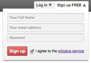
		<header class="clearfix">
			<nav>
				<ul id="tabs">
					<li id="login">
						<a href="" id="login-trigger" class="trigger">Log in <span>▼</span></a>
					</li>
					<li id="signup">
						<a href=""  id="singup-trigger" class="trigger">Sign up FREE <span>▼</span></a>
					</li>
				</ul>
				<div class="tabContent">
					<div id="login-content" class="formContent">
					  <form>
					     <fieldset class="inputs">
					        <input id="username" type="email" name="Email" placeholder="Your email address" required class="inputText">
					        <input id="password" type="password" name="Password" placeholder="Password" required class="inputText">
					     </fieldset>
					     <fieldset class="actions">
					        <input type="submit" id="loginBtn" value="Log in" class="btn">
					        <label><input type="checkbox" checked="checked"> Keep me signed in</label>
					     </fieldset>
					  </form>
					</div>

					<div id="signup-content" class="formContent">
					  <form>
					     <fieldset class="inputs">
					        <input id="fullname" type="text" name="fullname" placeholder="Your Full Name" required class="inputText">
									<input id="email" type="email" name="Email" placeholder="Your email address" required class="inputText">
					        <input id="password2" type="password" name="Password2" placeholder="Password" required class="inputText">
					     </fieldset>
					     <fieldset class="actions">
					        <input type="submit" id="signupBtn" value="Sign up" class="btn">
					        <label><input type="checkbox" checked="checked"> I agree to the <a href="">w3cplus service</a></label>
					     </fieldset>
					  </form>
					</div>
				</div>
			</nav>
		</header>
上面是整个HTML的代码,其实关键性的代码就是:
		<ul id="tabs">
			<li id="login"><a href="">Login<span>▼</span></a></li>
			<li id="signup"><a href="">Signup<span>▼</span></a></li>
		</ul>
		<div class="tabContent">
			<div class="formCotnent" id="login-content">
				login form
			</div>
			<div class="formContent" id="signup-content">
				signup form
			</div>
		</div>
这里我们使用了两个实体符来制作了三角形的效果:▼(▼)和 ▲(▲)有关于使用HTML的实体符制作图像,本站在《CSS3和HTML实体符制作带图片效果的Buttons》有介绍过,当然大家也可以使用另外的方法来制作这个三角形,比如说border制作三角,对此有兴趣的同学可以参考本站的《纯CSS制作的图形效果》。
CSS Code
		* {
			margin: 0;
			padding: 0;
		}
		html, body	{
			height: 100%;
		}
		/*===制作Body的渐变色==*/
		body{
			font: 12px 'Lucida Sans Unicode', 'Trebuchet MS', Arial, Helvetica;
			margin: 0;
			background-color: #d9dee2;
			background-image: -webkit-gradient(linear, left top, left bottom, from(#ebeef2), to(#d9dee2));
			background-image: -webkit-linear-gradient(top, #ebeef2, #d9dee2);
			background-image: -moz-linear-gradient(top, #ebeef2, #d9dee2);
			background-image: -ms-linear-gradient(top, #ebeef2, #d9dee2);
			background-image: -o-linear-gradient(top, #ebeef2, #d9dee2);
			background-image: linear-gradient(top, #ebeef2, #d9dee2);
			filter: progid:DXImageTransform.Microsoft.gradient(GradientType=0, startColorstr=#ebeef2, endColorstr=#d9dee2);
			-ms-filter: "progid:DXImageTransform.Microsoft.gradient (GradientType=0, startColorstr=#ebeef2, endColorstr=#d9dee2)";
		}
		fieldset {
		    border: 0 none;
		    margin: 0;
		    padding: 0;
		}
		input:focus, textarea:focus {
		    outline: medium none;
		}
		/*==清除浮动==*/
		.clearfix:before,
		.clearfix:after {
			content:"";
			display:table;
		}
		.clearfix:after {
			clear:both;
			overflow:hidden;
		}
		.clearfix {
			zoom:1;
		}
		/*==制作Header效果==*/
		header {
			display: block;
			padding: 8px 10%;
			border-bottom: 1px solid #fff;
			background-color: #777;
			background-image: -webkit-gradient(linear, left top, left bottom, from(#777), to(#555));
			background-image: -webkit-linear-gradient(top, #777, #555);
			background-image: -moz-linear-gradient(top, #777, #555);
			background-image: -ms-linear-gradient(top, #777, #555);
			background-image: -o-linear-gradient(top, #777, #555);
			background-image: linear-gradient(top, #777, #555);
			filter: progid:DXImageTransform.Microsoft.gradient(GradientType=0, startColorstr=#777, endColorstr=#555);
			-ms-filter: "progid:DXImageTransform.Microsoft.gradient (GradientType=0, startColorstr=#777, endColorstr=#555)";
			-moz-box-shadow: 0 -3px 3px rgba(0,0,0,.5) inset;
			-webkit-box-shadow: 0 -3px 3px rgba(0,0,0,.5) inset;
			box-shadow: 0 -3px 3px rgba(0,0,0,.5) inset;
		}
		/*===开始制作login Bar样式====*/
		nav {
			display: block;
			position: relative;
		}

		nav ul {
			margin: 0;
			padding: 0;
			list-style: none;
			float: right;
			background: #eee;
			border-bottom: 1px solid #fff;
			-moz-border-radius: 3px;
			-webkit-border-radius: 3px;
			border-radius: 3px;
		}
		nav li {
			float: left;
			display: inline;
		}
		#login {
			border-right: 1px solid #ddd;
			-moz-box-shadow: 1px 0 0 #fff;
			-webkit-box-shadow: 1px 0 0 #fff;
			box-shadow: 1px 0 0 #fff;
		}
		#tabs li a {
			display: inline-block;
			*display: inline;
			zoom: 1;
			height: 25px;
			line-height: 25px;
			font-weight: bold;
			padding: 0 8px;
			text-decoration: none;
			color: #444;
			text-shadow: 0 1px 0 #fff;
		}

		#signup a {
			-moz-border-radius: 0 3px 3px 0;
			-webkit-border-radius: 0 3px 3px 0;
			border-radius: 0 3px 3px 0;
		}
		#login-trigger {
			-moz-border-radius:  3px 0 0 3px;
			-webkit-border-radius:  3px 0 0 3px;
			border-radius:  3px 0 0 3px;
		}
		#tabs li a:hover,
		#tabs li.active a{
			background: #fff;
		}
		/*====制作表单容器效果===*/
		.formContent {
			display: none;
			position: absolute;
			top: 24px;
			right: 0;
			z-index:999;
			background: #fff;
			background-image: -webkit-gradient(linear, left top, left bottom, from(#fff), to(#eee));
			background-image: -webkit-linear-gradient(top, #fff, #eee);
			background-image: -moz-linear-gradient(top, #fff, #eee);
			background-image: -ms-linear-gradient(top, #fff, #eee);
			background-image: -o-linear-gradient(top, #fff, #eee);
			background-image: linear-gradient(top, #fff, #eee);
			filter: progid:DXImageTransform.Microsoft.gradient(GradientType=0, startColorstr=#fff, endColorstr=#eee);
			-ms-filter: "progid:DXImageTransform.Microsoft.gradient (GradientType=0, startColorstr=#fff, endColorstr=#eee)";
			padding: 15px;
			-moz-box-shadow: 0 2px 2px -1px rgba(0,0,0,.9);
			-webkit-box-shadow: 0 2px 2px -1px rgba(0,0,0,.9);
			box-shadow: 0 2px 2px -1px rgba(0,0,0,.9);
			-moz-border-radius: 3px 0 3px 3px;
			-webkit-border-radius: 3px 0 3px 3px;
			border-radius: 3px 0 3px 3px;
			width: 250px;
		}
		/*===制作form中的input效果==*/
		.inputs input {
			background: #f1f1f1;
			padding: 6px 5px;
			margin: 0 0 5px 0;
			width: 238px;
			border: 1px solid #ccc;
			-moz-border-radius: 3px;
			-webkit-border-radius: 3px;
			border-radius: 3px;
			-moz-box-shadow: 0 1px 1px #ccc inset;
			-webkit-box-shadow: 0 1px 1px #ccc inset;
			box-shadow: 0 1px 1px #ccc inset;
		}

		.inputs input:focus {
		  background-color: #fff;
		  border-color: #e8c291;
		  outline: none;
		  -moz-box-shadow: 0 0 0 1px #e8c291 inset;
		  -webkit-box-shadow: 0 0 0 1px #e8c291 inset;
		  box-shadow: 0 0 0 1px #e8c291 inset;
		}
		.actions {
		  margin: 10px 0 0 0;
		}
		/*==制作Buttons效果==*/
		.btn {
		  background-color: #d14545;
		  background-image: -webkit-gradient(linear, left top, left bottom, from(#e97171), to(#d14545));
		  background-image: -webkit-linear-gradient(top, #e97171, #d14545);
		  background-image: -moz-linear-gradient(top, #e97171, #d14545);
		  background-image: -ms-linear-gradient(top, #e97171, #d14545);
		  background-image: -o-linear-gradient(top, #e97171, #d14545);
		  background-image: linear-gradient(top, #e97171, #d14545);
			filter: progid:DXImageTransform.Microsoft.gradient(GradientType=0, startColorstr=#e97171, endColorstr=#d14545);
			-ms-filter: "progid:DXImageTransform.Microsoft.gradient (GradientType=0, startColorstr=#e97171, endColorstr=#d14545)";
		  -moz-border-radius: 3px;
		  -webkit-border-radius: 3px;
		  border-radius: 3px;
		  text-shadow: 0 1px 0 rgba(0,0,0,.5);
		  -moz-box-shadow: 0 0 1px rgba(0, 0, 0, 0.3), 0 1px 0 rgba(255, 255, 255, 0.3) inset;
		  -webkit-box-shadow: 0 0 1px rgba(0, 0, 0, 0.3), 0 1px 0 rgba(255, 255, 255, 0.3) inset;
		  box-shadow: 0 0 1px rgba(0, 0, 0, 0.3), 0 1px 0 rgba(255, 255, 255, 0.3) inset;
		  border: 1px solid #7e1515;
		  float: left;
		  height: 30px;
		  padding: 0;
		  width: 65px;
		  cursor: pointer;
		  font: bold 14px Arial, Helvetica;
		  color: #fff;
		}

		.btn:hover,
		.btn:focus {
		  background-color: #e97171;
		  background-image: -webkit-gradient(linear, left top, left bottom, from(#d14545), to(#e97171));
		  background-image: -webkit-linear-gradient(top, #d14545, #e97171);
		  background-image: -moz-linear-gradient(top, #d14545, #e97171);
		  background-image: -ms-linear-gradient(top, #d14545, #e97171);
		  background-image: -o-linear-gradient(top, #d14545, #e97171);
		  background-image: linear-gradient(top, #d14545, #e97171);
			filter: progid:DXImageTransform.Microsoft.gradient(GradientType=0, startColorstr=#d14545, endColorstr=#e97171);
			-ms-filter: "progid:DXImageTransform.Microsoft.gradient (GradientType=0, startColorstr=#d14545, endColorstr=#e97171)";
		}

		.btn:active {
		  outline: none;
		  -moz-box-shadow: 0 1px 4px rgba(0, 0, 0, 0.5) inset;
		  -webkit-box-shadow: 0 1px 4px rgba(0, 0, 0, 0.5) inset;
		  box-shadow: 0 1px 4px rgba(0, 0, 0, 0.5) inset;
		}

		.btn::-moz-focus-inner {
		  border: none;
		}

		form label {
		  float: right;
		  line-height: 30px;
		}

		form label input {
		  position: relative;
		  top: 2px;
		  right: 2px;
		}
到此我们使用样式美化工作就算是完成了,这里很多属性对于大家来说都很熟悉了,因为使用了大多数CSS3的属性制作效果。如果大家对CSS3还不是很熟悉的话,我建议您先了解其相关的属性使用。这样对你会有很大的帮助。如果您想学习更多的CSS3知识,你就点击本站的CSS3专栏,里面包括了CSS3的基本属性的使用方法和相关实例。
jQuery Code
上面我们花了很多行的篇幅书写了案例的CSS样式,下面的jQuery代码是帮助我们完成此例的功能,具体的就看代码吧:
		<script type="text/javascript">
		$(function(){
			var fromContent = $(".formContent"),
		      tabsli = $("#tabs li");

	    tabsli.click(function(){
	    	var el = $(this);
		    el.find("span").html("▲");
		    el.siblings().each(function(){
		    	$("span", this).html("▼");
		    });
		    el.addClass("active").siblings().removeClass("active");

	      fromContent.hide();

	      var activeFormContent = el.attr("id") + "-content";
	     	var loginForm = $("#" + activeFormContent).slideToggle();

	      return false;
	     });

			fromContent.click(function(){
				return false;
			});

		  $(document).click(function(){
		  	fromContent.hide();

				tabsli.each(function(){
		    	$("span", this).html("▼");
					$(this).removeClass("active");
		     });
		  });
		});
		</script>
这段jQuery代码在此要非常感谢爱前端的茶哥帮忙修改,大家要是对这段jQuery感兴趣,也可以加入我们的讨论
这样我们最终效果就实现了,大家可以点击DEMO
今天这次有关天CSS3制作下拉登录和注册框的教程就算是结束了,最后在结束之前我需要再次感谢Red大师给我们带来这么好的教程《Simple and effective dropdown login box》、《Slick login form with HTML5 & CSS3》。同时也再次感谢茶哥的js帮助,希望大家喜欢这篇教程,如果更好的建议可以直接给我留言,我很乐意和大家一起学习。
如需转载烦请注明出处:W3CPLUS
nike air max 1 footlocker